 WebHostDesignPost
When designing your site you want to decide what font you are going to use. When choosing your font be aware that they could render differently. Font size, font weight, and your operating system could affect the outcome.
You web typography can have a different effect on your users depending on how you use it. From sans-serif vs serif fonts, to web safe fonts, and even custom fonts. Your website can drastically change depending on your typography choices.
Typography Doesn't Have To Be Hard
As we design we all go through hundreds of fonts trying to find the perfect one. There are some tips and tricks to help you narrow it down much quicker.
Knowing some of the reasons to use a sans-serif font vs a serif font can be the difference of readability.
Sans-Serif vs Serif Typeface
When looking through different fonts you will notice some small differences. One considered a sans-serif and the other a serif typeface.
A sans-serif typeface is the most common used. Arial and Verdana on a Windows operating system and Helvetica for a Mac operating system. To recognize a sans-serif font you will notice they have flat spots on the bottom of their letters.
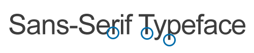
Sans-Serif typefaces have a clean cut off at the bottom.
A serif typeface you will recognize is Times New Roman and is probably the most popular serif font used. The best way to determine if your font is serif typeface look at the bottom of the letters for their feet.

Serif typefaces have small feet at the ends of their text.
Windows, Mac, and Linux

Each operating system has their own selection of fonts. Even different operating versions could have some discrepancies. For example, Windows Vista has different fonts than Windows XP.
When choosing a font that isn't isn't support by the operating system. The operating system will choose one for you. This is based on your CSS font-family attribute.
If you allow the operating system to choose a font for you, this could not only change the layout of your page. But could change the readability of your text.
Web Safe Fonts
These fonts are common between all versions of Windows, Linux, and Mac. They are known as the web safe fonts. Using any of these you have a 99% chance that the text on the page will be rendered correctly.
- Andale Mono
- Arial
- Arial Black
- Century Gothic
- Comic Sans MS
- Courier New
- Helvetica
- Georgia
- Impact
- Times New Roman
- Trebuchet MS
- Verdana
Web Typography Size and Weight

When choosing your font-family you need to find a good size and weight. Font size can differ between the different operating systems. A font size of 12pt on a Windows operating system is smaller than a font size of 12pt on a Mac operating system.
Font weight is also important when adjusting font sizes. When choosing a bold font weight, size can change how thick the bold effects is.
A small font size will not take the bold attribute as much as the larger the font size. The larger the font, the thicker the bold. This can change your focus point in your design.
Web Typography CSS Tip
When choosing your font-family for your website. The proper font-family CSS attribute is required to make cross browser compatibility a must.
The CSS font-family attribute will tell the browser which font to use first. If not found, which to use second and finally which typeface.
Using CSS EM Measurement
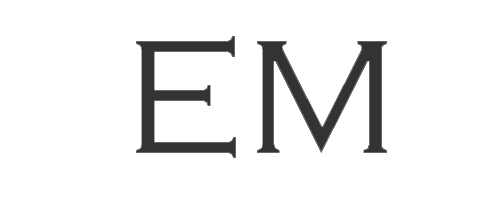
With font sizing being an issue with different operating system and browsers. Another CSS tip is using em to determine your font size instead of px.
An em will take a defined font size and then increase or decrease from that point. This gives any environment a starting point and working up or down.
Typography can be Fun!
There might be fonts on your developing computer that you might love. It might not be the best choice to use for your site. Play around and be creative with your web typography.
Just keep in mind what your users will be using. If their computer can’t find the font, it could change the outlook of your page. Readability is key and using a web safe font is a guaranteed way.

Comments (1)
What Do You Think?