Web 2.0 is great buzz word that has caught designers and developers. It doesn't have much meaning behind it. If you have a site with a web 2.0 design, then you probably have round corners, gradients, and a clean layout. These elements are not a must for a web 2.0 design, but are the latest trend.
Simple means Simple
Simplicity is the key goal for web 2.0. You want to keep your navigation, layouts, and content as simple as you can. Your features should only be what is necessary and what is required for the user.
Keep plenty of whitespace and a balance of images. Keeping your site simple will help your site's usability and lower your bounce rate.
Navigation

Your navigation is one of the most important features on your site. Keep this as simple as possible. Try to make is large, bold, and clean. With text the is easy to read and the user knows exactly what they are going to find.
Make some type of motion or mouseover with your hyperlinks. Users like to have a visual interaction to know what is a link and what is just text.
Bold Colors
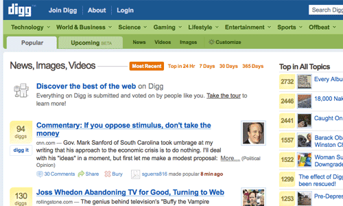
Web 2.0 has more color and are bold. Dull soft colors are in style at the time and developers are using a lot of blues and greens. For backgrounds soft pastels and neutral colors are a great choice.
Your colors are what attracts your user to your site. Also you can use your colors to focus your users to a specific place on your site.
Gradients

Gradients colors also fall into this category. Gradients are a great way to blend colors into your whitespace. Gradients are also used for navigation backgrounds, text boxes, and icons.
The reflection effect has been used using the same concept. Using a gradients white or black to transparent.
Graphical Icons
![]()
Icons are being more and more popular by day. But note that this doesn't mean we are using more. Developers are using bigger and stronger icons. These icons have been used with text to help make a clear and visual response.
Users are visual people.
An icon with a picture of a shopping cart, for example, will tell your visitor where the shopping cart is. This idea has also implemented a lot on navigational elements.
Big Text, Badges and Stars
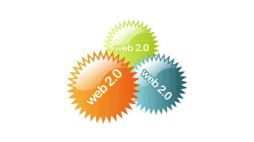
Bigger text has now a role in development. Developers are dropping their small paragraph sales pitch. Now they are making it a couple of words long and making it bigger.
This is not only drawing attention to your text, but also making more room on your page for other things.
Badges have been around marketing for a long time. But has never been really used for development. These are the sticker that are round circles or stars that are filled with bright colors. These serve one purpose and that is to draw attention to the user.
These badges and stars do work.
Lots of Whitespace
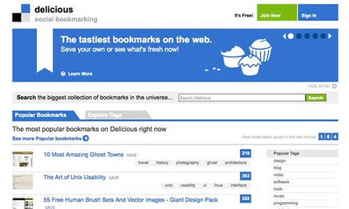
Busy sites are slowing being redesigned. Ecommerce stores are even slimming down their homepages and giving them more whitespace. This is great for the user and your usability.
Giving your page plenty of whitespace will give you a more cleaner and professional look. It will make your site easier for your user to find what they are looking for.
Web 2.0 Principles

There is a lot more techniques and elements that are included in the movement of web 2.0. These are some of the basics to watch for if planning a new design.
The biggest element to watch for is simplicity.
This is the biggest trend that has evolved in this trend. Like all design nothing is written is stone. Most of these techniques were done by design thinking out of the box. Try something new and see what happens, it might be the next big thing.
 WebHostDesignPost

What Do You Think?