 WebHostDesignPost
If you have been doing web development long enough, you have probably noticed there are different unit sizes you can use.
There is pixels (px), ephemeral units (em), root ephemeral units (rem) and percent. They all seem to change the size of your text, containers and other elements in HTML.
Which one am I suppose to use?
Let's Start The Debate

There are a lot of debates on this topic, but there are some rules of thumb for each one. As like all rules in web development, it is important to follow them. But they are not written in stone and there are times that it necessary to break them.
The biggest differences you will find in the type of sizing units is how they react to scaling the size of your internet browser. Some scale better than others, and others will react different depending on the internet browser and computer operating system the user is using.
Using px as Your Sizing Method

A pixel is equal to one dot on your computer screen. With px, you can lock an element in place to an exact location on the page. Or you can have an element be exactly a certain size. This could be useful to keep you design pixel perfect with your web design.
This can have a negative impact with mobile users or a liquid web design. Your elements won’t adjust for the size of the web browser, they will stay the same size you specified.
Using em as Your Sizing Method

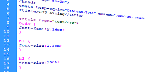
This unit is becoming a popular choice for web developers. An em will take the defined font size of your page and then increase or decrease from there. For example if you have your <body> elements set at 16px, then 1em will be 16px, 1.5em will be 24px, 2em will be 32px.
Why this is a good choice is that different operating systems? Both desktop and mobile may have a different opinion on what is 16px. By using an em to increase or decrease elements, this will adjust from you a threshold (1em) and move from there.
Using rem as Your Sizing Method

Using rem is exactly like using the em method. What is different with the rem is that it will use the root element of the page, a.k.a. the <html> tag, for its threshold.
Whatever size the <html> tag is defined at, the rem will use this as a starting point. Then increase and decrease from there with the same principle as em.
Using Percent as Your Size Method

By using the percent as your sizing method, this is probably the easiest one to understand what is happening visually in your code.
If you have something 100% and something 150%, you can notice that the one element will be 50% bigger than the other. If you need something twice as big, just double it.
REM VS EM

rem vs em is hard to separate. They both relatively work the same, but I would recommend using em over rem. This gives you more control over your baseline and rem is only supported in newer internet browsers. You will get more compatibility across desktop and mobile devices with em.
Take note that rem sizing method is not supported. in older web browsers. These versions do supported the measurement: Internet Explorer 9+, Safari, Chrome and Firefox 3+.
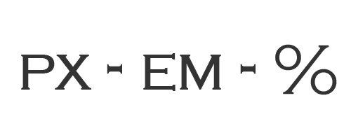
PX VS EM

I wouldn't say that you should use one over the other. It depends on the situation. For example, you would use exact pixels if you are designing for a responsive mobile design. Having the exact pixel will ensure that your layout certain resolutions are exactly the correct size. Pixels are also useful to keep images from breaking your site's design.
As for font-size, padding and margins, using an em will keep things more balanced when user are on different browsers and screen resolution. By increase or decrease from a baseline, everything will expand or contract equally.
EM VS Percent
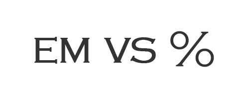
As these two sizing methods work in the same manner, they will give you close but different results. By comparing all the different options, these two will give you the closest results between each other. But again you will want to use percent for defining widths in elements, such as liquid web design or responsive mobile designs.
Compare the Difference
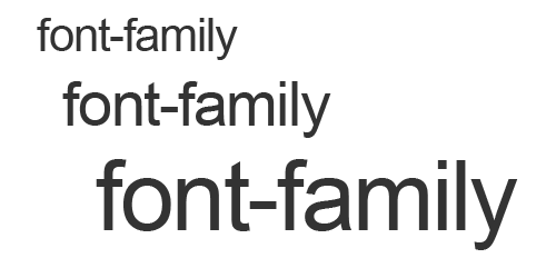
It is important to see the differences between the types to sizing. Below are some font-sizes and padding different between px vs em vs rem vs percent.
*These sizes are based off WHDP's current design.
font-size: 16px
font-size: 24px
font-size: 32px
font-size: 1em
font-size: 1.5em
font-size: 2em
font-size: 100%
font-size: 150%
font-size: 200%
font-size: 1rem
font-size: 1.5rem
font-size: 2rem
Which One Should I Use
I believe you should use all of them. Each one has the best practice depending on what you want to accomplish. You might want to steer away from rem, because of it’s not fully supported at the time of this writing. Start using them all and start identifying how each one reacts to increase and decrease sizing.
 Newsletter Signup
 Popular Articles
 Recently Updated Articles
Comments (2)
What Do You Think?