 WebHostDesignPost
Having a mobile website is a must for the future of web development. More mobile websites are using a responsive design. With the cell phone marketing growing each day there is going to be more of a demand.
Even Google is now devaluing sites that don't have a mobile design. This could cause a gain or loss in traffic depending on your mobile usability. There are a few elements you can implement to your site to give you a head start.
Simplify Your Current Website
Changing your site to a mobile website isn't an easy task. Most websites modify their existing site into a smaller version. They usually remove most of their images and only post their headlines to articles.
You will need to simplify your layout too. Advanced CSS techniques and complex layout designs will cause some problems. You need to be able to easily have your website change between the different mobile screen sizes.
Keep Things Clean
With simplifying your layout and design you need to watch how many images you have for your mobile site. Cell phone internet speed isn't quite up to par with a LAN line.
You need to watch how much content you are displaying on your page. Having too many images can make your website very slow and give your visitors a reason to leave.
Problems With Mobile Design
The biggest problem that developers will run into is the different screen size resolution. There are all types of screen sizes for mobile devices and each one has their own internet browser.
The best thing to do is to set up Google Analytics and track what resolutions your visitors are using. Google Analytics will also show what internet browsers your users are using to view your site.
Then target the most popular resolution and work your way done. It is important to do cross browser compatibility checks on your mobile site.
Most common mobile design resolutions:
- Laptops - 1024 x 728
- Tablets - 768 x 1024
- Large Cell Phones - 480 x 728
- Medium Cell Phones - 375 x 728
- Small Cell Phones - 320 x 728
- Tools to Help You On The Way
It is tricky to test your design on different devices. There are some tools out there that can help you.
Google Chrome Development Tools
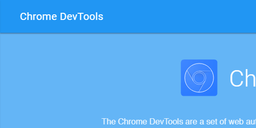
You can easily emulate the different mobile device resolutions straight from the internet browser.

The most accurate testing service, but does require a monthly subscription. Uses actual devices to test resolutions.
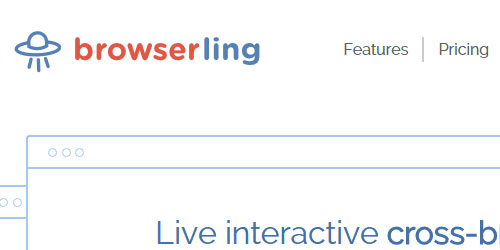
Similar to BrowserStack as it cost money, but does provide an accurate testing environment.

Limited testing but does provide different resolution. Great addition if already using Dreamweaver.
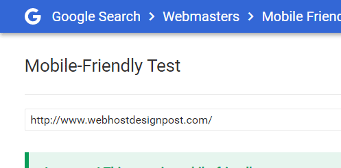
Test your site in Google's eyes to see if your site is mobile-friendly. Great tool to make sure you are not getting hurt in your search engine ranking.
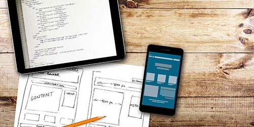
Mobile Design Examples
You can also look at what other designers are doing with their own website. See how each one simplifies and hides / shows elements depending on the size of the page.


Plan > Develop > Test > Repeat
Mobile websites is a growing trend in the web development and will continue to grow. The best thing is to plan out what your mobile site “needs”. Then develop and continue to test. This market is changing rapidly and so will your mobile site.

 Newsletter Signup
 Popular Articles
 Recently Updated Articles
Comments (14)
What Do You Think?