 WebHostDesignPost
To meet the growing demand for content that is not only viewable on a computer, but also on mobile devices. Developers are turning to responsive web design.
At one time developers were forced to create a separate mobile website for their clients. Or risk the possibility of inferior mobile formatting or severe degradation to their sites. Responsive web design allows for a single, fluid design that adapts to mobile with ease.
There is a mobile first mentality that goes into responsive design. Using the different coding techniques like Javascript, jQuery, and CSS will help get you there.
Responsive Web Design Definition
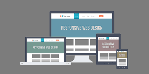
Responsive Design also known as RWD. Is a way to design your website to be optimal visible to any desktop or mobile device. This is dynamically changing the layout, navigation, size of text and graphics depending on the resolution of the device. This minimizes zooming, panning, or scrolling to have the site readable and functional.
Flexibility Is Key
You may remember when websites that adjusted to a different resolution, was called using a liquid layout. This was having the same idea but is a much smaller form.
Having a liquid layout was nowhere near what responsive design is. But it has some of the same traits. It gives your website the ability to adjust itself on the fly, without breaking the site.
The most common way is having percent (%) measurements for your div widths. This way it is calculated to how big the browser window is.
.content { width: 80%; }
How CSS Media Rules Work
Responsive design is dependent on using CSS stylesheets, more importantly, the @media rule. By using these media rules you can specify different CSS attributes to trigger on at set widths.
.container { width: 768px; }
}
.container { width: 480px; }
}
The code above shows us that our div container width is set to 100%.
If you look at the @media rule, the width will change if the user's device resolution is 768px or under. It will set the div container width to 768px. (Tablet Device)
And if the user's device resolution is 480px or under, it will set the div container width to 480px. (Mobile Device)
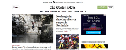
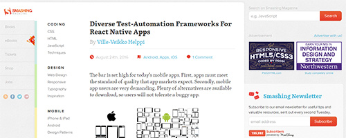
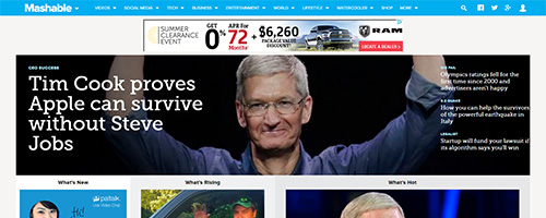
Responsive Design Examples
The following are some great examples of responsive web design that understood the importance of this new innovation:

Make Sure You Plan
If you are planning new design project, I would consider integrating a responsive design. In my past experience, it is easier to start with a fresh design with responsive in mind. Then converting an existing design into responsive.
Mobile Will Continue to Rise
Mobile devices will continue to rise and more people will start to use them as their primary device. Statistically, there has been a staggering incline in the last five years.
The fact is, people no longer want to be tied down to their desk, we live in a more mobile world.
Mobile computing is not a bubble or a trend as traditionally thought, but a reality and the future. Do not make the error of being sluggish to adapt. As a developer, we need to embrace the coming change. Create designs that our readers and customers can use, with ease, where and when they want?

 Newsletter Signup
 Popular Articles
 Recently Updated Articles
What Do You Think?