 WebHostDesignPost
Web design is an opinionated subject. There are elements that some will like and dislike. This is is the most common web design mistakes that most designers agree you shouldn't do.
1. Advertising

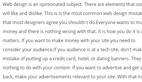
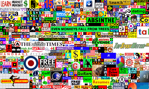
Everyone wants to make money and there is nothing wrong with that. It is how you do it is what matters. If you want to make money with your site you need to consider your audience.
If you audience is at a tech site, don't make the mistake of putting up a credit card, hotel, or dating banners. They have nothing to do with your content. If you want to advertise and get a kick back, make your advertisements relevant to your site. With that in mind don't clutter and trick people to click on them.
2. Splash Screen

A splash screen is a waste of the developer's and your visitor’s time. You don't want to force your visitor to watch or read something they aren't interested in. Nothing is worse than having to wait 30 seconds for a movie to play.
They want to what information your site has. Find what they are looking for and get out. If you have your heart set on a splash screen, make sure you put a link to skip it.
3. Too Much Text
Web development is an interesting market. You have to cater to two different worlds. You need to have a lot of good content for search engine ranking, but interesting enough for your visitors to read.
Having too much text together is a bad thing.
If you have too many words and content blocks on your site, your visitors aren't going to read it. Try to design designated areas where text will go and other design elements will follow.
4. Overcrowded Content
Watch your content length and images you are putting on your page. This can affect usability and loading time. Keep you site focused on your goal and stay organized.
White space on a site is just as important then the content
Break up your content with headers. This will make it more enjoyable and easier for your users to scan. The most important thing about content is not the length, but the quality. Write what needs to be said and stop.
5. Color Design
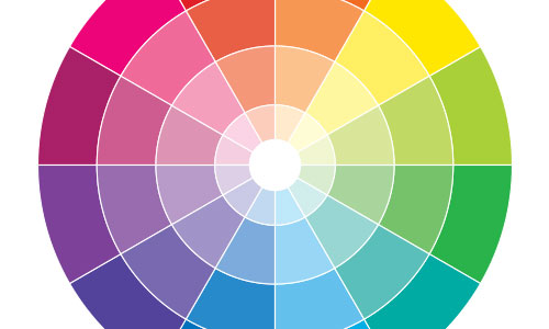
Colors are your best friend and your worst enemy. Be careful of the colors you are using. If your site utilizes a dark background make sure your font is a light color and visa a versa.
I always recommended a white background with dark text.
Stay away from bright colors. Dull colors are not only in style now, but are very clean, easy to read, and professional.
Try choosing a web safe color for your design. As this isn't much of a problem with modern computer. There still could be a chance that the computer will pick a color for you that isn't recognized.
6. Horizontal Scrolling
As computer monitors get wider so do our websites. But going too wide will give your visitors a horizontal scroll bar. This is a huge problem, because your user could be missing elements on your page.
The standard width for a site is 1024 x 768 pixels. This is changing dramatically as new monitors and resolutions evolve.
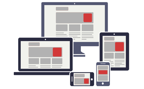
A better way to compbat this problem is using responsive design.
7. Flash is Dying
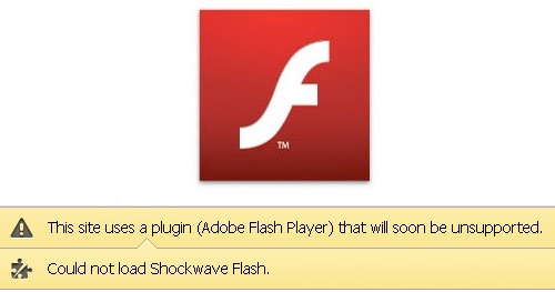
Flash is cool and is interactive, but don't use it for your entire site. Flash sites have huge usability problems, loading time, and security issues. Developers get caught up in the interactivity of Flash and forget the basics of design.
Flash is very good at videos, advertising, and interactive applications. As we continue to HTML5, there will be less Flash elements. Mobile devices are already stop supporting it.
8. Cross Web Browser Capability
There are a lot of different web browsers that people use to surf the internet. And developers hate it. Some coding techniques are hard to please all the different internet browsers.
You need to make sure that you don't dedicate your site to only one of them. Test your site is all internet browsers. You can review your design in different browsers with Brower Shots.
The four main browsers you need to focus on are Google Chrome, Internet Explorer, Firefox, and Saffari.
9. Usability
If you haven't been thinking about usability Stop and think.
Web design usability is important, it should be your main goal. With small fixes and changes to your site, it could change how your visitor reacts to your site. If your visitor can't interact with your site and has problems finding what they are looking for. They are going to leave.
10. Above The Fold
You may have heard someone say "keep it above the fold". This imaginary line is what the users see when they load your site and doesn't scroll.
This is important.
Design your most important elements above this line. If you are trying to sell a product or service and you put your call to action at the bottom. Chances are that you aren't going to sell many of them.
To find you average fold line on your website, install Google Analytics.
Have Fun and Make Mistakes

One part of learning and making a great design is making mistakes. Don't worry if you do, that is part of the designing process. What you want to develop in your workflow is identifying the problems and making the decision to change it.
You need to take your site serious, but you also need to have fun. Try to think out of the box and see what happens. Break the rules and try new things.
You will have more success in doing something you like.

Comments (1)
What Do You Think?