 WebHostDesignPost
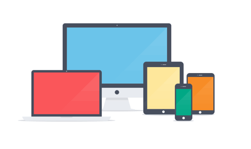
In the last year with mobile devices growing and growing, there has been a push for a trend called Flat Design. But this hasn't only stayed in mobile development. Web designers have taken up some of these traits and implemented them into their own designs.
Flat Design is designing your application or website with simplicity in mind. Not just making things easier to use, but making the design barbones
What is the Difference?
In the years of Web 2.0 we have seen a lot of glassy buttons, gradient background, and a lot of bright colors. Designers that use flat design have gone away from that.
Now you will find one colored buttons, blurry huge background images, and dull colors. Another big trend is the amount of whitespace surrounding elements with bigger font size.

Why Should I Care?
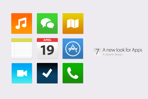
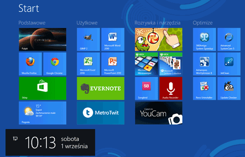
Microsoft was one of the first major companies to try this new trend on their latest operating system. There has been a positive response and others have followed. The new Apple iPhone IOS has incorporate the flat design into their icons set.
If two of the biggest companies in technology have incorporated this idea, there must be a reason for it.
The Mobile Push
What is pushing the Flat Design trend is mobile applications. Having only a small amount of space to work with and having a concern of internet speed. Developers have taken a hold of this style and have made it the next best thing.
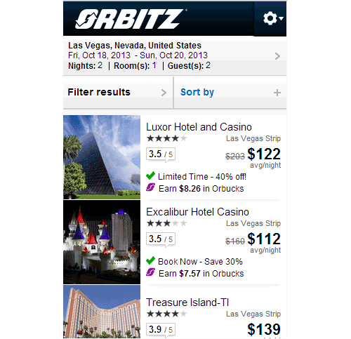
For a consumer this is great. Having limited options and minimalist design makes using the application a great experience. Take a look at Orbitz mobile site below. Notice how easy it is for someone to find a hotel. They have all the information they need in a 320 x 480 screen.
The Grid System
As Pinterest found the way to make boxes not so boring, a lot of Flat Design follows the Grid system. It’s putting everything into boxes or rows and columns. You have the feeling that have a series of giant buttons that you to click on.
Dull Colors
This is one of my favorite things about Flat Designing. Designers will choose colors that are particularly dull or saturated. The reason I love this trait is because there are so many website that try to blind you with a bright colors.
The examples below are some of the basic colors in our color wheel. Notice how they don’t jump out at you but still give you an indication of brightness.

Icons, Icons, Everywhere
With the flat colors and squared up shapes, to add the final touch is putting a nice icon with it. Icons are great for usability. Most people respond more confidentiality to visual images.
For example:
Putting an icon next to your navigation to indicate the section. Or putting an icon next to sub navigation like my account, login, or logout.
Will Flat Design Stay
For the mean time, yes. We will continue to see an increase of flat design in mobile applications and in web design. As like any other web design trends, it will fade out and die, then something else will take its place. For the mean time enjoy the simplicity and usability of what Flat Design brings to the table.
What Do You Think?